Kudos to Active.com for putting together an excellent browsewrap checkout screen. I had to navigate through the screen recently in order to sign up for the St. Louis Rock ‘n’ Roll half marathon.
When courts determine whether to enforce online terms and conditions, they tend to focus on whether users had notice of the online terms and whether they assented to them. To my mind, the perfect notice and assent procedure would require the terms to be loaded onto the user’s computer screen for long enough to ensure that the user had sufficient time to read them. The user would also be required to agree to the terms using a certified electronic signature. Biometric authentication and a quiz on the substance of the terms and conditions would be a plus.
But, alas, none of my clients to date has been willing to put such barriers between their customers and the sale. In fact, website owners tend to prefer browsewrap checkout procedures over clickwrap procedures. Browsewraps feature a hyperlink to the terms located close to an “action” button, while clickwraps require the terms to be loaded onto the user’s screen as well as a click of a button by the user indicating agreement to the terms. Plenty of courts have enforced browsewraps, but website owners are on shakier ground than if they use a clickwrap procedure.
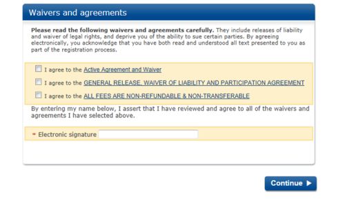
Here’s a shot of the Active.com checkout screen:

If you own a website and you want to use a browsewrap checkout procedure, this is a good example to refer to. As with all browsewraps, the various terms documents are hyperlinked and the user isn’t required to click on the documents in order to check out, but the user is required to click on check boxes indicating agreement to the terms. In addition, the user is required to enter text into an “electronic signature” box.
One of the best features of this checkout screen is the text at the top that points out some of the more onerous features of the terms from the user’s perspective—the limitations of liability and waivers of rights. Thus, even though most users won’t actually read the terms documents themselves, they still have notice of some of the more important substance. This should give Active.com an advantage if its terms or checkout process are attacked as being unconscionable.
Even a browsewrap checkout procedure as good as this one is less likely to be enforced by a court than a good clickwrap procedure, and I still like my idea of biometric authentication. But this is about as good a browsewrap checkout screen as I’ve seen.

